Preface: This is part one of a series of posts about building a mapping application using Backbone.Marionette.
It’s always a good idea to design out your app before you start coding, so let’s do that now. Of course we are NOT building ArcMap in a Browser here – instead we are going to (try) to design a simple, intuitive map that shows very specific information – in this case, wildfire data served by GeoMac.gov.
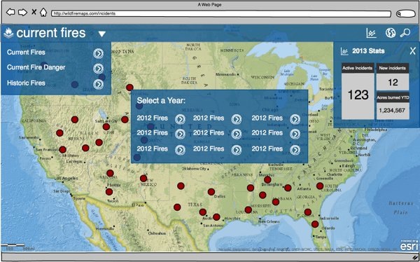
We are going to have 3 distinct “states” of the application – Current Fires, Current Fire Danger, and Historic Fires. The mockup shown below shows the main interface elements: the “navbar” across the top, the “drop down” on the left, the “stats area” on the right, and some “tools” in the upper right. The center area will be used for selecting the year for the Historic Fires, as well as the Search & Search Results.

Not shown on the mockup is the legend that we will set up across the top. We’re not gonna get too complex with the legend, but we will show some key info there.
Divide and Conquer
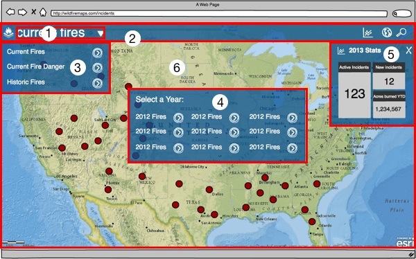
So – that’s what we are aiming at. Let’s start thinking about how we will divide this up into “Views” in the Backbone sense. Here is the same screen shot, but divided up into our views

I’ve broken them down by name as follows:
1) CurrentItemNameView
2) Navbar
3) ItemListView
4a) DataYearView
4b) SearchView (not shown – same container)
4c) SearchResultsView (not shown – same container)
5a) StatsView
5b) FireDetailView (not shown – same container)
6) MapView
As you can tell, in this app we have areas of the screen that will be re-used by different functions. This is a somewhat unique thing about a mapping application in that most of the time, we want the map center stage, but for some operations, we want a “dialog” type interaction.
The Code
The first code drop can be found on GitHub tagged as v0.0.1. Each post in the series will get a different tag, so if you happen to navigate to the main branch, you’ll get the latest and greatest, but if you want to follow along, go to the tags.
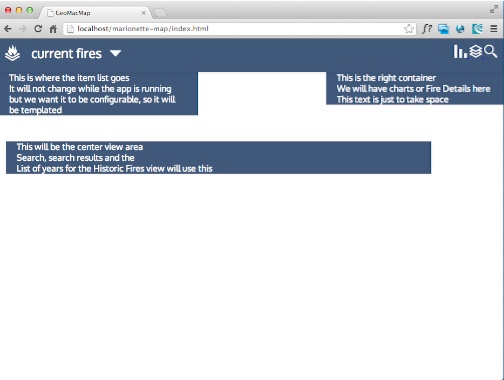
The main thing in this first drop is to tackle the layout. This is pretty simple markup and css so I’m not going to delve into the details – the following gist shows the code.
Even though I’m working from some existing production code, I’m massively streamlining the css here, so I suspect that I’ll be coming back later on to swap out the images for icon web fonts, but this is a reasonable start.

Up Next!
Ok, so this was really just giving us some structure to work with, but it had to be done. Next, we start building the app, and slinging some javascript to setup the Application, some Regions, the Modules and Controllers.